Apply the rule of thirds
The rule of thirds has long applied to fine art and photography, but it also applies to web design. When designing your site, use an overlay with two horizontal lines and two vertical lines evenly spaced.
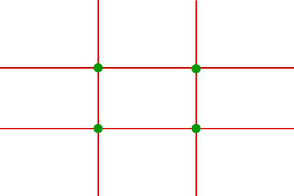
The green dots are points at which the eye naturally drifts when looking at a scene, whether it’s a landscape photograph or a web page.
Knowing this, you can put your CTAs (Call to Actions) and other important elements on those dots. Just make sure the rest of your web design flows naturally around those elements.
This compositional approach can work for any type of website.

In the example above, our attention is drawn to the tagline, logo, and menu.